Tuesday, December 16, 2025 · Stamps & Postal History
2025 Topps Shoebox Treasures #15 Topps Logo Autograph: A Close Look at the #/35 Card
Noted by [email protected] (Stack22) · 650 reads
A clear Topps laminate gives this #/35 autograph card a subtle surface detail that’s easy to miss in scans.


Card review: 8.8
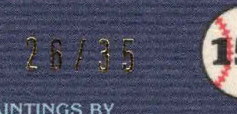
The most distinctive feature on 2025 Topps Shoebox Treasures #15 “Topps Logo Autograph” is also the one that takes the closest look to appreciate. A clear laminate carries repeated Topps lettering across the card. In a scan, that surface detail nearly disappears; even in hand, it can be difficult to pick out at first glance. The red lettering provides the clearest contrast, making the pattern easier to see there than elsewhere.
That subtlety gives the card a different kind of appeal from a design that announces its special treatment from across the table. Here, the effect depends on light, viewing angle and the colors beneath the clear layer. The autograph sticker identifies this as the autograph variant, while the repeated logo pattern supplies the less obvious visual distinction. Collectors comparing images online may need to zoom in, but the close-up views below show where the laminate stands out most.
Two groups of 35
The autograph version is numbered to 35. There is also another 35-card group without the autograph sticker, bringing the reported total across those versions to 70 cards. That distinction matters when describing the card: the #/35 numbering refers to this autograph variant, while the additional 35 belong to the version without the sticker. The source doesn’t provide individual serial numbers or further details about how those two groups were distributed.
The repeated Topps lettering is a surface treatment rather than a large, high-contrast graphic. That makes it easy to overlook when the card is photographed at ordinary size. A scan can flatten the reflective qualities of a clear layer, and the logo pattern may blend into the printed design. The close-ups are useful because they direct attention to the red text, where the pattern reads more clearly. Collectors checking a listing can compare both the overall card and the detail images instead of relying on a single small photograph.


A card that rewards a second look
My read is that the laminate is the card’s central talking point, but it’s a restrained one. “Topps Logo Autograph” sounds like a prominent logo treatment might dominate the front; in practice, the repeated lettering is faint enough that the card can look much plainer in a scan than it does when examined closely. That gap between the first impression and the detail is part of what makes the variant interesting to inspect.
The card receives an 8.8 review score. The collector writing the review has one copy and says there’s no urgency to track down the other 34. That personal collecting note fits the card’s niche character: the appeal here is the combination of an autograph sticker, the #/35 designation and a laminate detail that takes a little effort to spot. It’s a specific variation to pursue for someone who enjoys small production distinctions and surface effects.
Listings and collecting pace
The reviewer reports seeing the same copies appear unsold and then get listed again on eBay, while describing themselves as the only person they could identify actively pursuing the card at the time. They mention being willing to pay $5–10, while observing that some sellers seemed to hold out for prices between $30 and $500. Those figures are the reviewer’s account of their own collecting experience and the listings they saw, not a record of completed sales. No sale date or confirmed transaction is provided.
For collectors weighing a listing, the practical takeaway is to keep the description precise. Check that the card is the autograph version with the sticker, confirm the #/35 marking, and use clear images to inspect the laminate. The source offers no grading details, condition report or documented sale result, so those points can’t be filled in from the available information. One copy is currently in the reviewer’s collection; whether to pursue more is a matter of personal interest and the asking price on a particular listing.
This Topps Shoebox Treasures card is a modest variation with a detail that photographs don’t always capture well. A close look at the red lettering makes the clear Topps pattern easier to appreciate, while the separate autograph and non-autograph groups keep the #/35 description specific. For now, the strongest guide is the card itself: inspect the surface closely, compare the version being offered, and let the subtle design be the reason to collect it.